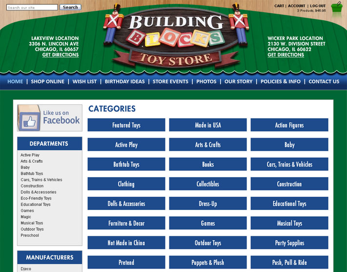
For your category page, you have some options. We can set it up to use icons or to show the text name of the category as a stylized button.
By default we setup new sites to show the text name of the category as a stylized button, as this takes less time to for you to manage, and typically the site looks better in the long run (it’s easy to forget to add icons when creating new categories)
Please inform your project manager if you prefer to use icons, or if you are currently using icons and wish to switch to showing the text names of the categories as a stylized buttons.
Examples below:
A) without icons (as stylized text button).
This is the recommended option, and is the easiest option to maintain (you don’t need to add thumbnails)

B) with image based icons:
![]()
