Images help your site look great and add to the interest of the page…

However, images can become stretched on a mobile screen if they are not set to the right size.

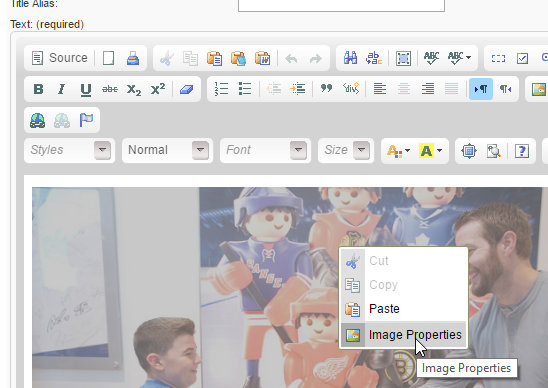
so when adding or changing an image, Right-click it and select Image Properties:
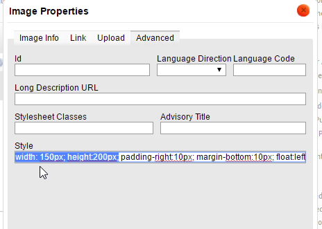
From that dialog, select the Advanced tab:
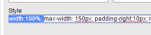
Among other things that may be listed on this page, you should see a width and height, as shown here (may be some variance in order):
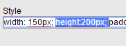
To make sure this image is mobile-friendly, follow these steps:
-
Remove the height measurement. The image will maintain its aspect ratio based on the image width.
-
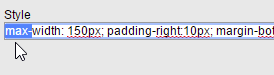
Add “max-” in front of width to tell it the image may be no wider than the size that was set as the standard width.
-
Add “width:100%;” to the style code, so that if the screen is thinner than the max width set above, the image will scale to be 100% the width of the screen.
Be sure to save your changes and proof on a mobile device.