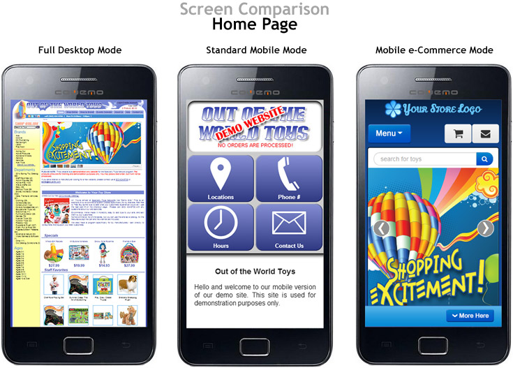
When changes or updates are made to your mobile site (whether it be the Standard Mobile Configuration or the eCommerce Mobile), it is always important to test these changes on a mobile device, such as a smartphone or small tablet (please note that some tablets, especially larger ones, are likely to show the desktop site, so a smartphone works best). Be sure to test all the main options, buttons, and links and proof your main content pages, to make sure everything works correctly and is mobile-friendly (which means it resizes to fit on a mobile screen).
Proofing a mobile site using a computer
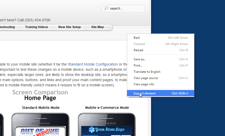
If you do not have a smartphone or tablet available to proof your mobile site, there is a desktop alternative that makes testing a mobile site simple. If you are viewing your site with your Google Chrome internet browser, you can press the F12 key (or right-click on the background and select “Inspect Element”) to open Chrome’s Developer Tools, as shown here:
IMPORTANT: after you turn on the mobile emulator, you will need to click the browser’s Refresh button or press CTRL+R to view the mobile site.
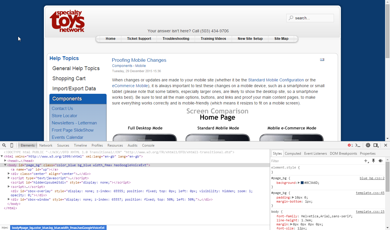
Once you have opened the Developer Tools, you will typically want to click the “Dock to Right” button  (next to the X on the developer tools header), so you will be able to preview your mobile site better.
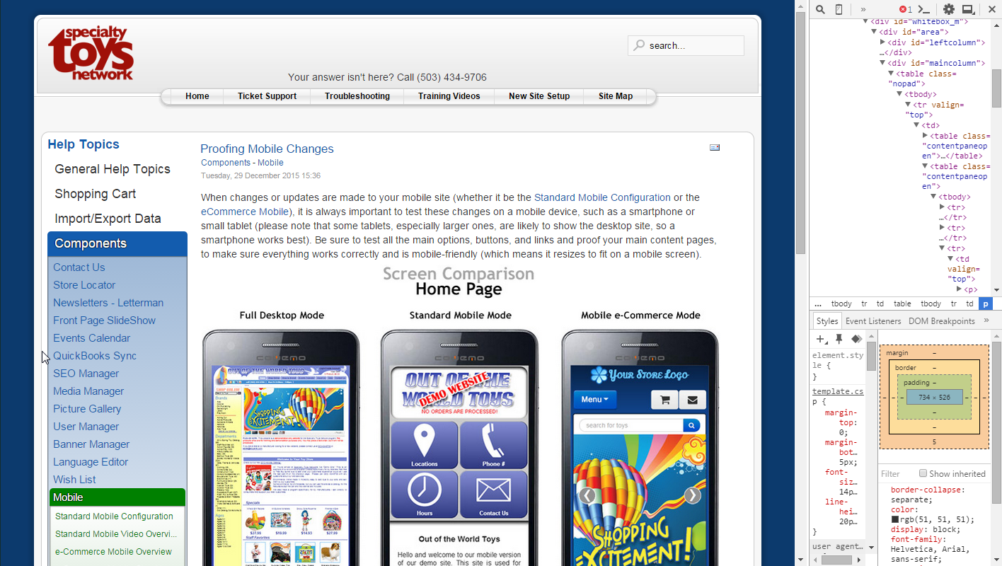
With your Developer Tools to the right of your site, you are now ready to view the mobile version. On the top bar of the Developer Tools, find and click the “Toggle Device Mode” icon: 
IMPORTANT: When you click this icon, it will resize your site to a mobile size, but you will need to click the browser’s Refresh button or press CTRL+R to view the mobile site.
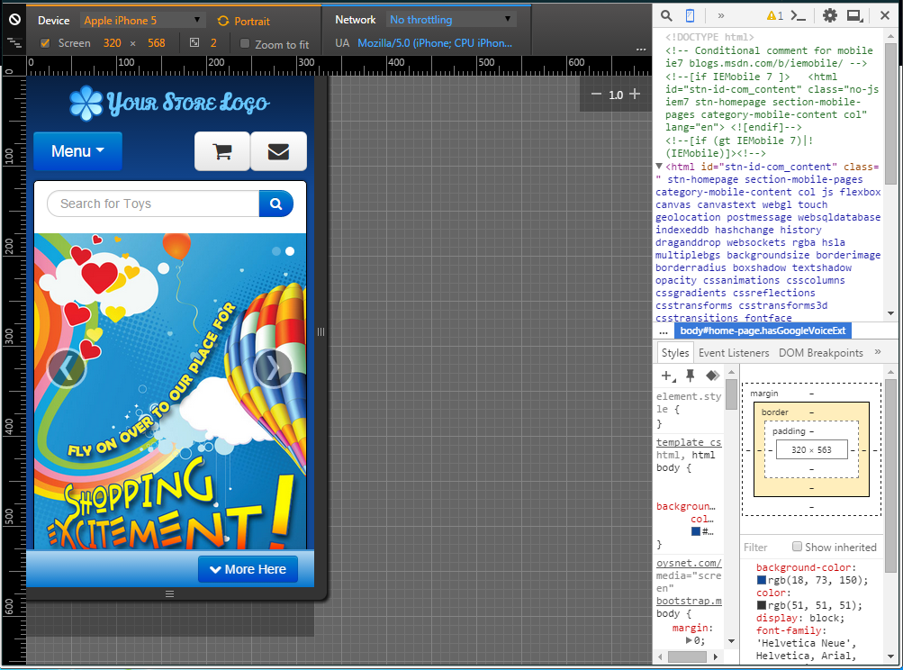
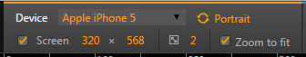
The Device Mode menu will then allow you to test out multiple different device sizes from the dropdown (refresh required each time you switch devices), view in Portrait (vertical screen) and Landscape (horizontal screen), and even set a custom screen pixel size and ratio.
When you are done proofing your mobile site and wish to return to your desktop site, click the Toggle Device Mode icon again and refresh your page, at which point you can close the Developer Tools panel. Closing Developer Tools without toggling device mode will NOT switch back to desktop view.
Things to keep in mind when working on your mobile site
-
Keep content succinct
If someone is looking at your site on their phone, they don’t want to scroll through a long page of text; they want fast browsing. Keep your mobile content short and simple so it fits well on the phone screen. -
Set flexible widths on images
If you want to add an image, go to the Image Properties > Advanced settings and change the style line from “width: 1234px; height: 200px;” to “max-width: 1234px; width:100%;” by removing the set height and adding the max-width, this tells the image to scale to 100% of the width of the screen it is on, up to the natural width of the image (set in the max-width). -
Use a call to action
Mobile content’s goal should be to get the consumer to do something, whether that be buying a product or coming in to the store. It is especially important to have at least one call to action in your mobile content, such as a “Click Here”, “Buy It Now”, or “Come Visit Us”, as a link, a button, or even a graphic, to get the customer where you want them to go. More links to keep the customer moving around your site means it is more likely they will land on the content or product you are trying to direct them to.