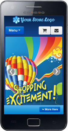
Note: This page is for creating content for eCommerce Mobile. To sign up for an eCommerce Mobile site, Click Here.
The e-Commerce mobile site version is a great way for you to show and sell your products to those customers who are using smart phones. Unlike the standard mobile site component, the e-Commerce mobile version was developed to support full product display, promotional marketing, and shopping cart checkout – all on the mobile platform.
Managing your eCommerce mobile site is simpler than you would expect. If you have already mastered the basics of managing your website, then you have the skills you need to manage mobile content as well. There are only a couple main sections where mobile content needs to be managed:
-
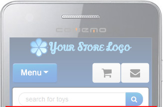
The main menu at the top (Click Here for more info)
-
The mobile homepage banners (Click Here for more info)
-
The Mobile Featured Products (Click Here for more info)
-
The “More Here” footer menu (Click Here for more info)
-
The Social Media banners, in the footer menu (Click Here for more info)
-
The mobile content pages (Click Here for more info)
This help page will cover the basic ins and outs of managing content in each of these places.
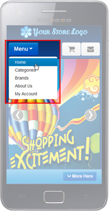
Managing the e-Commerce Mobile Main Menu
The Main Menu for the e-Commerce mobile site is a separate menu from the one on your website, but it is managed just like your desktop main menu.
To manage the menu items: login to the back-end of your site and then navigate to Menu > mobilemain. From there, you can add, remove, and reorder links the same way you do on your desktop site menu. For more information on managing your menu items, see hhttps://help.stoysnet.com/content-management/menu-manager
Note: Special care should be taken to make sure that the pages you link to for your mobile site are optimized for the mobile environment.
Be sure to check your changes on a mobile device!
 |
 |
 |
Managing the e-Commerce Mobile Homepage Banners
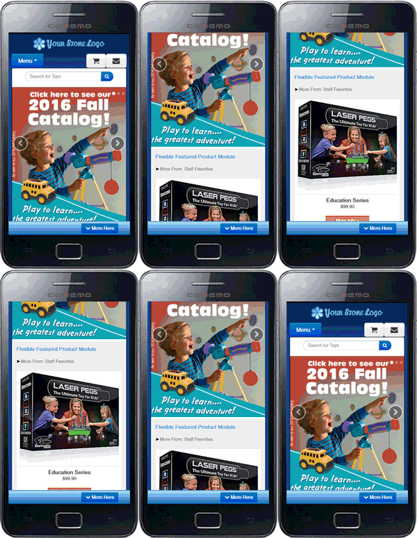
The home page on the e-Commerce mobile site has the option to display graphical banners in a carousel. Like the other banners on your site, these are managed using the Banner Manager. Please contact your project manager if you have any questions about the specs for creating new banner graphics, or if you would like to order new graphics for your mobile site. (Remember, as part of the set up fee, STN will create up to 3 promotional banners to support your home page carousel.)
Mobile homepage banners are a bit different from regular banners in a few ways and need to have some special attention. Due to the small screen size, some of the image is often blocked by phone browser menus, slide navigation buttons, etc. For this reason, it is important to keep any titles and important information at the top of the banner and away from the edges.
Banner Category: Mobile Homepage Banners
image Width: 550 pixels
image Height: 625 pixels
For information on how to create your own mobile homepage banners, Click Here >>
Be sure to check your changes on a mobile device!
Featured Products (Featured Flex)
Scrolling down below the eCom Mobile Home Banners, you will find the Mobile Featured Products module (also known as the Featured Flex module). The products displayed by this module can be filtered by category or by brand, and can be set to display any number of products, though 3 is recommended. Be sure to specify where you would like to pull products from when setting up your mobile site. If you are unsure, check with your project manager.
This module is included in the cost of the eCommerce Mobile package, or for clients who already have eCom mobile, it can be added in for a $25 installation fee.
Be sure to check your changes on a mobile device!
 Managing the e-Commerce Mobile Content Pages
When creating content articles for your mobile site, it is important to keep in mind that mobile devices do not display all elements the same way a desktop monitor does. Always check your updates to mobile content on a mobile device. Here are a few other things to keep in mind when creating mobile content:
-
Some mobile content pages are generated by a module, but may not look that way in the content editor. For instance, on the mobile Contact Us page, instead of rewriting all of the information from your desktop contact us page, the mobile page uses a call to pull in that information, like this: {mosloadposition mobi-cntc}
Be aware that if you remove this call, the information it was pulling in will no longer be displayed. However, this may be a good thing if you would prefer to write your own content for that page. -
Not all elements display the same way in mobile as they do on a desktop computer. When creating mobile content, try to avoid things that will not resize easily, such as table structures, large images, or embedded items like videos or forms. When displayed on a mobile device, these items tend to extend off the edges of the screen, making some content inaccessible.
Be sure to check your changes on a mobile device!
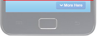
Managing the e-Commerce Mobile “More Here” footer
On the e-Commerce mobile site there is an optional “More Here” footer panel that, when clicked, displays additional links and information. There are 3 different parts of this menu, and each part is managed in a different way.
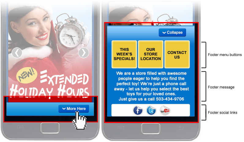
Footer menu buttons
- These buttons are managed as a menu, which can be accessed by clicking Menu > mobilefooter. This menu can comfortably support up to 3 links. For more information on managing your menu items, see https://help.stoysnet.com/content-management/menu-manager
Footer message
- The footer message is a content item that can be found by navigating to Content > Content by Section > Mobile > Mobile items. To create a new message to be displayed in this area, you can either edit the current content item, or you can create a new item and assign it to the Moble Content category. Only one content item will display at a time, so if more than one is published, the text will change out when the page is refreshed. For more information on managing content items, see https://help.stoysnet.com/content-management/content-articles
- The social media icons displayed at the bottom of the mobile footer menu are banners assigned to the Mobile Social Banners category. Once your mobile site had been built, a collection of mobile social media banners will be pre-loaded on your site, so if you create a new Facebook page, for instance, you can simply create a new banner, assign it to the Mobile Social Banners category, select the Facebook icon image, and set the link. All pre-loaded mobile social banners are designated by the suffix -bttn-38.png in the image name. For more information on setting up a new banner, see https://help.stoysnet.com/banner-manager/creating-banner-ads.html
Be sure to check your changes on a mobile device!
